Design System 3
Kadlec’s brand identity is represented in its truest form through the harmony of every visual asset—the design system. Signature, shape, color, imagery, typeface, texture, and the logic that governs all of them combine to create an engaging
representation of the brand personality. Any one visual component could exist independently. However, the best brands use layered synergy, with maximum impact realized when all of the parts unite. Visual synergy is provided by the Design System,
which is the map for how each component best interacts.
As with any successful creative engine, flexibility must be afforded to accommodate the wide variety of content and application needs. Within a set of prescriptions and rules, the designer has creative license with which to innovate. The letter-of-
the-law is not the goal, but rather the essence of the Kadlec brand consistently communicated over time.
|
This Design System features multiple gradients, introducing Kadlec’s Blue, Slate, and Gray harmoniously. Our Beacon shape becomes a central component of this system, making use of crisp diagonals to create unique spaces for content. Design System
3 provides a stable balance of image and text, while highlighting our expanded color palette and shapes. Is it for both promotional and information purposes.
|
 |
| |
|
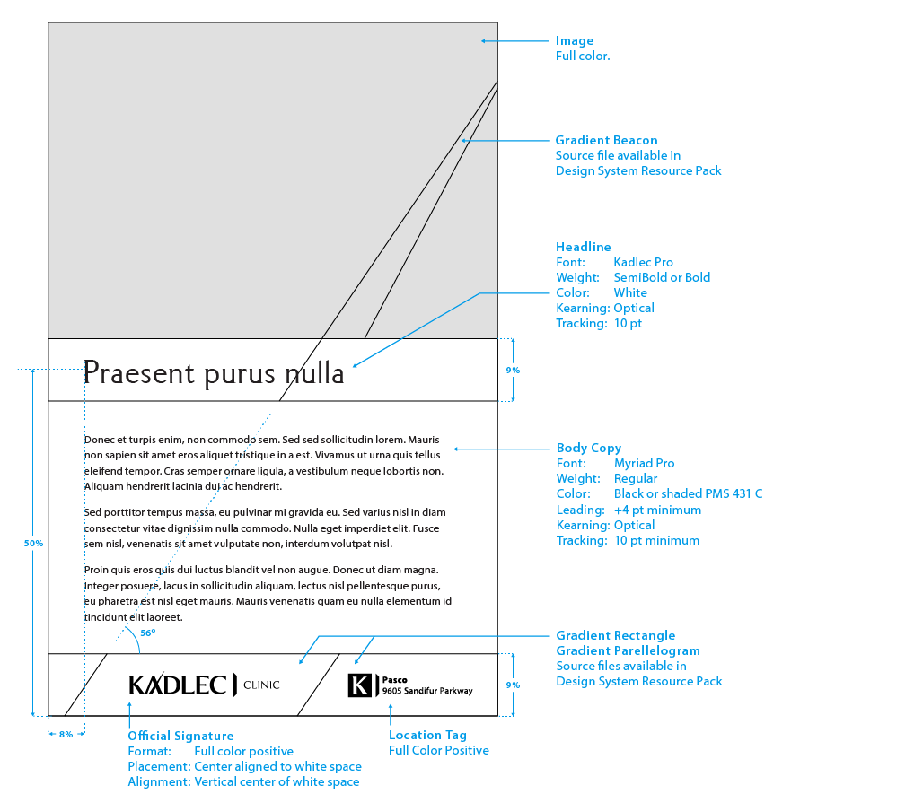
Portrait
This is an example of an on-brand Design System 3 portrait promotional product. Note the use of gradient from Blue to Gray, while preserving clean, white real estate for the Signature. We do not recommend recreating
shapes and color fields for this Design System, but rather using a pre-built template available through Kadlec’s Marketing Department.
|
 |
| |
|
This Design System features multiple gradients, introducing Kadlec’s Blue, Slate, and Gray harmoniously. Our Beacon shape becomes a central component of this system, making use of crisp diagonals to create unique spaces for content. Design System
3 provides a stable balance of image and text, while highlighting our expanded color palette and shapes. Is it for both promotional and information purposes.
|
 |
| |
|
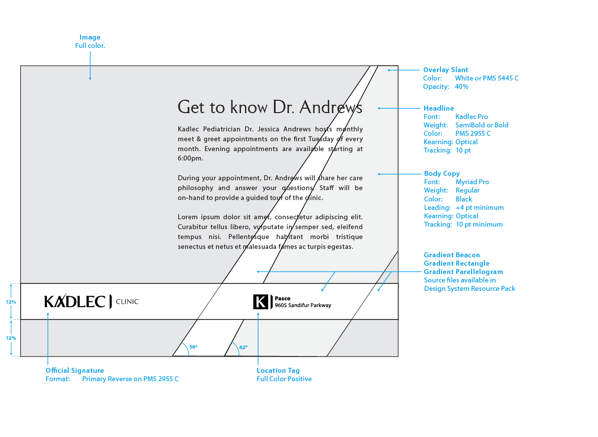
Landscape
This is an example of an on-brand Design System 3 landscape promotional product. Note the use of gradient from Blue to Gray, while preserving clean, white real estate for the Signature. We do not recommend recreating
shapes and color fields for this Design System, but rather using a pre-built template available through Kadlec’s Marketing Department.
|
 |
| |


