Design System 2
Kadlec’s brand identity is represented in its truest form through the harmony of every visual asset—the design system. Signature, shape, color, imagery, typeface, texture, and the logic that governs all of them combine to create
an engaging representation of the brand personality. Any one visual component could exist independently. However, the best brands use layered synergy, with maximum impact realized when all of the parts unite. Visual synergy is provided
by the Design System, which is the map for how each component best interacts.
As with any successful creative engine, flexibility must be afforded to accommodate the wide variety of content and application needs. Within a set of prescriptions and rules, the designer has creative license with which to innovate. The letter-of-the-law
is not the goal, but rather the essence of the Kadlec brand consistently communicated over time.
|
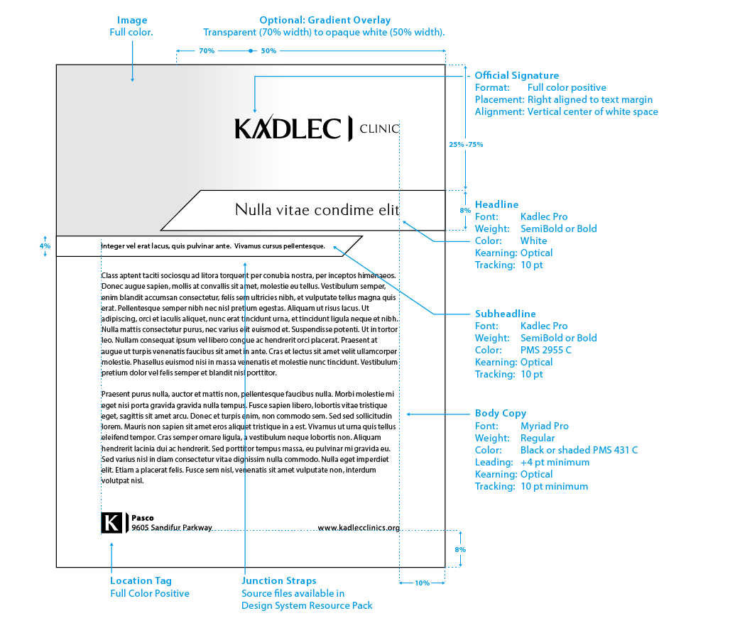
Design System 2 is a highly versatile system, allowing for both informational and promotional applications. Many features on the page can be adjusted to better suit the intended purpose of the collateral:
-
The photo header and junction straps can adjust vertically to allow for more or less text.
-
The junction straps can be reversed left to right and swap colors to better suit the photo.
-
The gradient overlay is an optional element that allows a variety of photo formats to be applied to the space, the key rule here is that the Kadlec signature must be backed by a mostly white space allowing proper clear zone.
All vendors, please closesly review all of the rules and standards associated with this system, ensuring that you understand it completely. Kadlec’s Marketing Department, as well as their Agency of Record, can answer additional questions.
|
 |
| |
|
Portrait
This is an example of an on-brand Design System 2 informational product. Note the use of the gradient to both back the Kadlec signature and to cover the mid-page end of the photograph used.
|
 |
| |
|
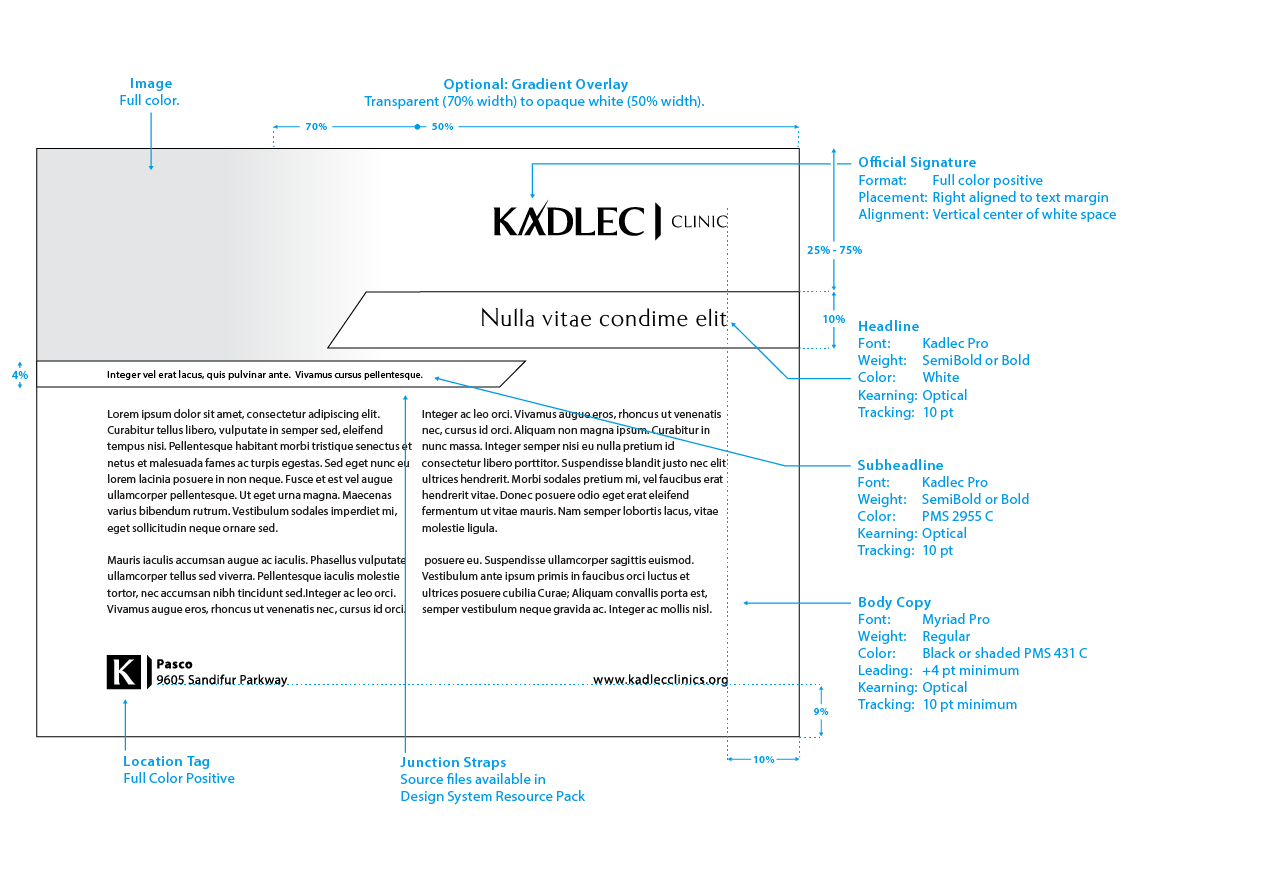
Design System 2 is a highly versatile system, allowing for both informational and promotional applications. Many features on the page can be adjusted to better suit the intended purpose of the collateral:
-
The photo header and junction straps can adjust vertically to allow for more or less text.
-
The junction straps can be reversed left to right and swap colors to better suit the photo.
-
The gradient overlay is an optional element that allows a variety of photo formats to be applied to the space, the key rule here is that the Kadlec signature must be backed by a mostly white space allowing proper clear zone.
All vendors, please closesly review all of the rules and standards associated with this system, ensuring that you understand it completely. Kadlec’s Marketing Department, as well as their Agency of Record, can answer additional questions.
|
 |
| |
|
Landscape
This is an example of an on-brand Design System 2 informational product. Note the use of the gradient to both back the Kadlec signature and to cover the mid-page end of the photograph used.
|
 |
| |


