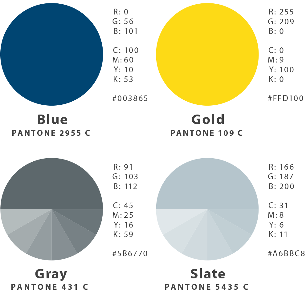
Color Palette
Color is perhaps the strongest emotional driver among brand components. This deceptively simple visual asset creates psychological associations, and influences opinion. It is also a strong determinant of consumer recall and recognition. Kadlec’s color palette has been refined to support core brand values and an accurate representation of the brand personality.
It is crucial that every color used in Kadlec’s communication media is in accordance with the provided specifications, and verified before publishing.
Notes
When printing communication products, always request a proof and compare the result against Pantone®’s color matching system. When using digital files, be aware that color modes, profiles, and file types will influence color accuracy.
